Choosing a neutral paint should be easy. It is beige, or grey, or white. Then it goes on the wall and suddenly the grey looks lilac, the beige looks pink and the white looks faintly green. The culprit is the undertone: the subtle colour hiding inside every neutral. Learn to see it and you will stop wasting tins of paint.
What an undertone is
Almost no paint is a pure colour. A grey is made from black and white plus a little of something else, often blue, green, red or yellow, that gives it character. On a small card, under shop lighting and surrounded by other colours, that hidden tint is hard to see. On four walls of a room, it multiplies and becomes obvious.
Broadly, undertones fall into two families:
- Warm undertones: yellow, red, orange, pink. They make colours feel cosy and soft.
- Cool undertones: blue, green, violet. They make colours feel fresh and crisp, sometimes cold.
How to spot the undertone
Compare, do not look alone
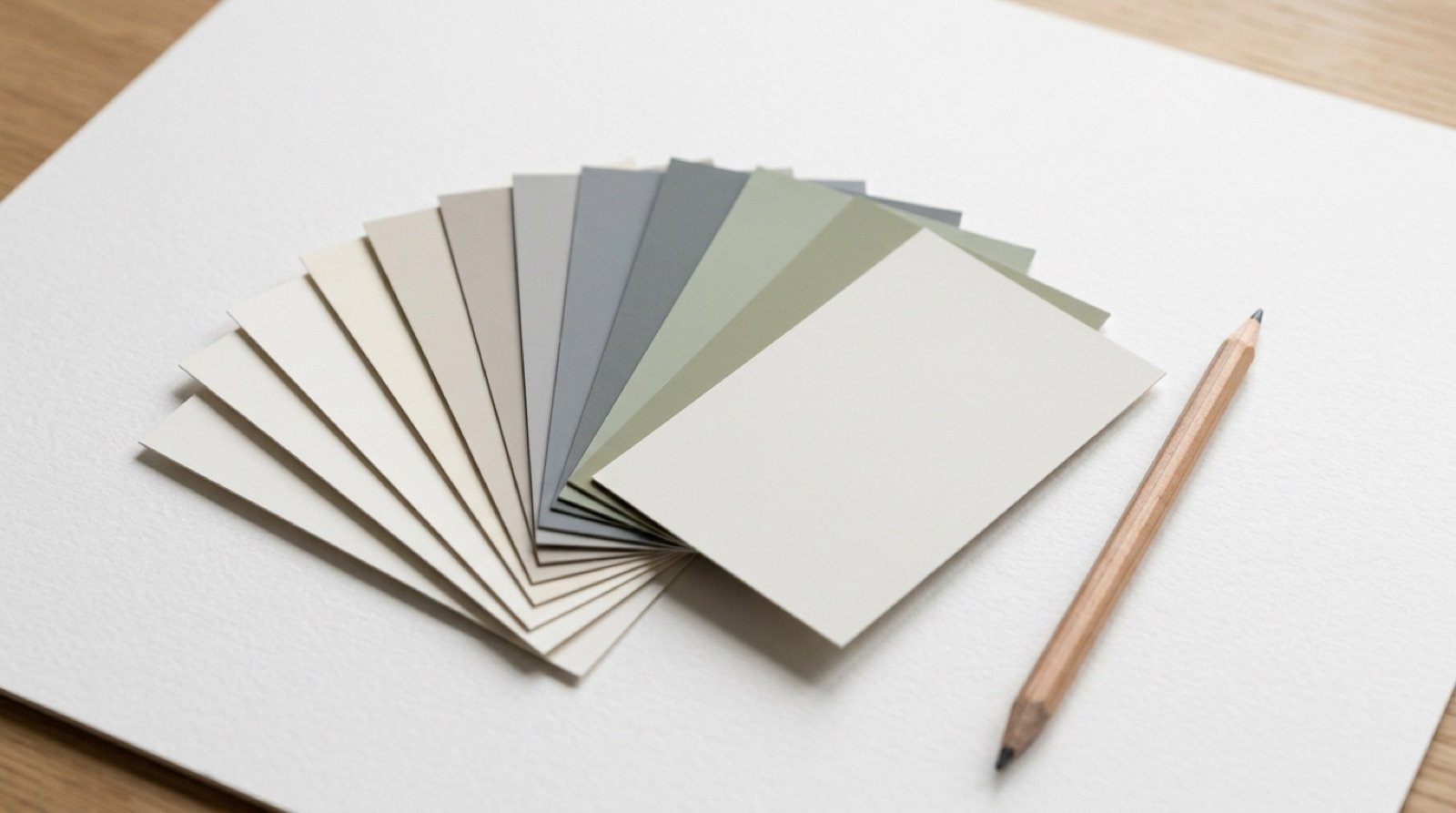
An undertone is almost invisible on its own. Place the swatch next to a few similar colours and it appears immediately. Next to a pure white sheet of printer paper, a “white” paint will show whether it leans yellow, pink, grey or blue. Next to other greys, one will look greener, another bluer.
Look at the darkest colour on the strip
Paint cards often show several shades of the same colour from light to dark. The darkest shade reveals the undertone most clearly. If the bottom of a strip of greys ends in a slate blue, the pale grey at the top will lean blue on your wall.
Check it against fixed things
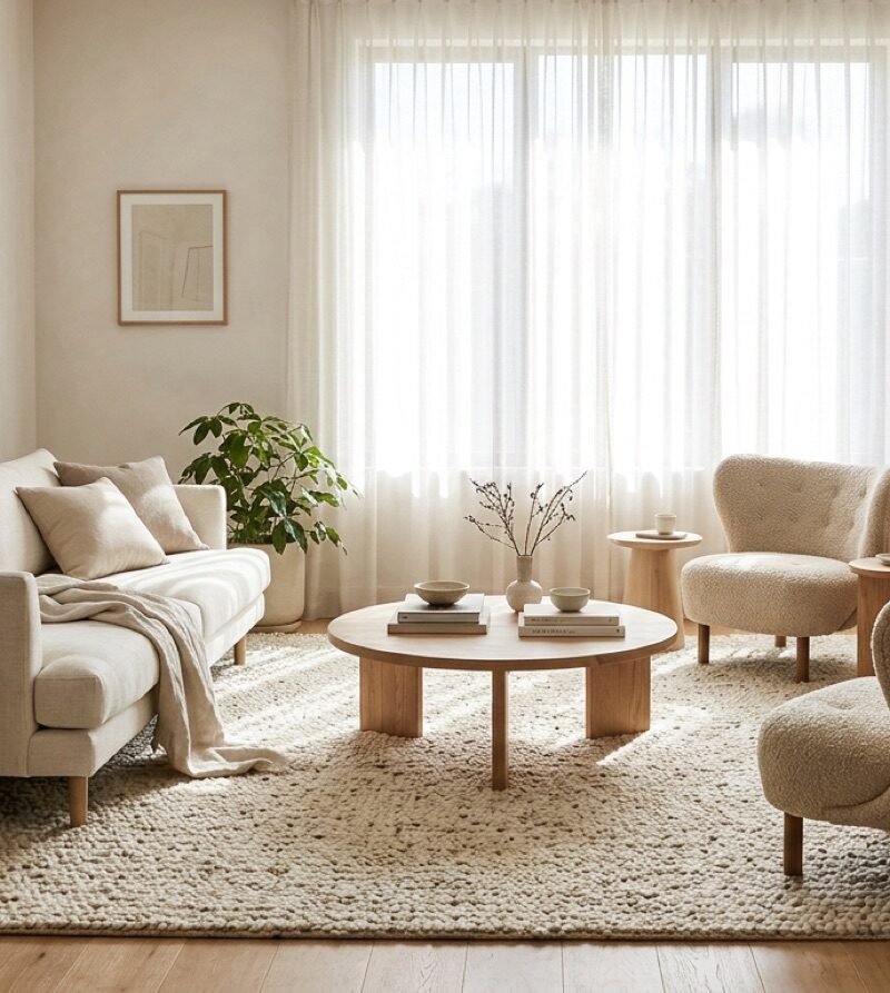
Hold the swatch against your floor, kitchen units, sofa and stone. Undertones that clash look dirty or “off”. A cool blue-grey beside a warm honey oak floor can make both look wrong, while a warm greige ties them together.
Matching undertones to the room
- North-facing rooms have cool light, so warm undertones usually feel better. Cool greys can look dull and cold.
- South-facing rooms have warm light and can take cooler undertones, which balance the warmth.
- Rooms with warm wood floors often look best with warm or neutral undertones.
- Rooms with cool stone or grey tiles suit cooler or neutral undertones.
For more on how direction changes colour, read reading light before you choose materials.
Common surprises, explained
- “My grey looks purple.” It has a red or violet undertone, made stronger by cool light.
- “My white looks yellow.” It has a warm undertone, made stronger by warm light or yellow bulbs.
- “My beige looks pink.” It has a red undertone. A beige with a yellow or green undertone looks more natural in many rooms.
- “My greige looks green.” Greige often carries a green undertone, which reads stronger beside green plants or in north light.
Finish matters too
The same colour looks different depending on the finish. Matte paint absorbs light and hides wall imperfections, and colours look softer and slightly darker. Eggshell and satin reflect a little light, wipe clean more easily and suit kitchens, bathrooms, hallways and woodwork. Gloss is highly reflective and best kept for small details.
A simple routine for choosing
- Choose three to five candidates that you like.
- Compare them side by side against white paper to see their undertones.
- Remove any that clash with your floor and large furniture.
- Paint large samples and look at them at different times of day.
- Live with the remaining two for a few days before deciding.
It feels slow, but it is much faster than repainting a room.