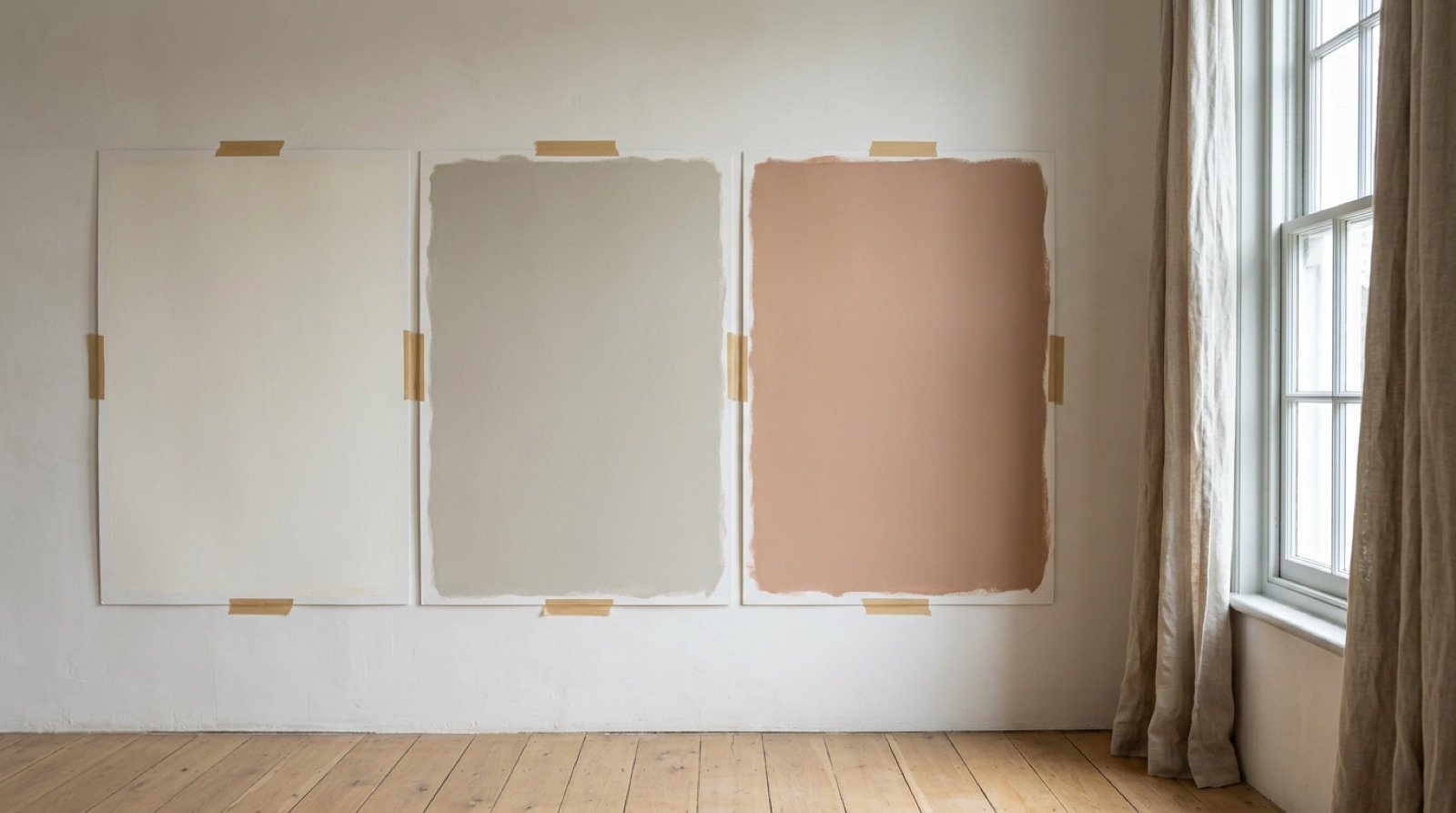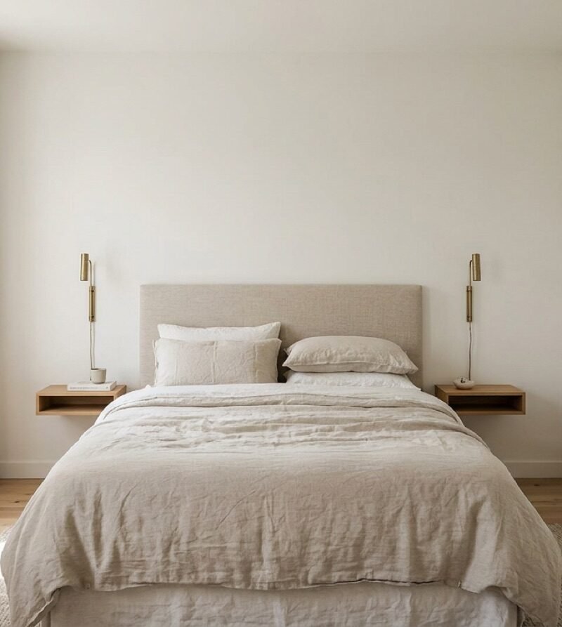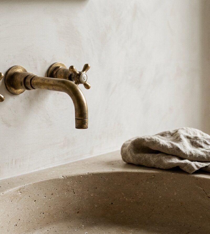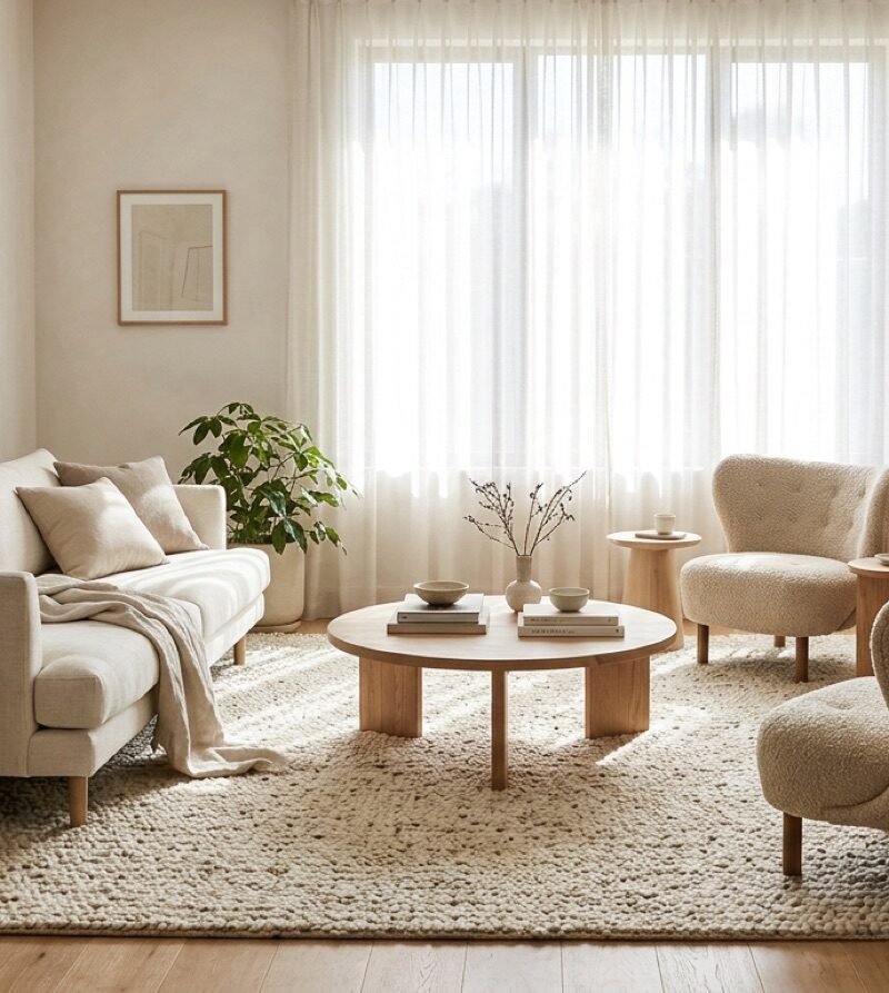
If you have read anything about colour in interiors, you have met the 60-30-10 rule. Sixty percent of a room in a dominant colour, thirty in a secondary colour, ten in an accent. It is repeated so often that many beginners treat it as the definition of a well-designed room.
It is a useful rule. It is also a blunt one. Used well, it stops a room from turning into a patchwork. Used without thinking, it produces rooms that are tidy, balanced and forgettable. Here is what the rule actually does, and when to step away from it.
What the numbers really measure
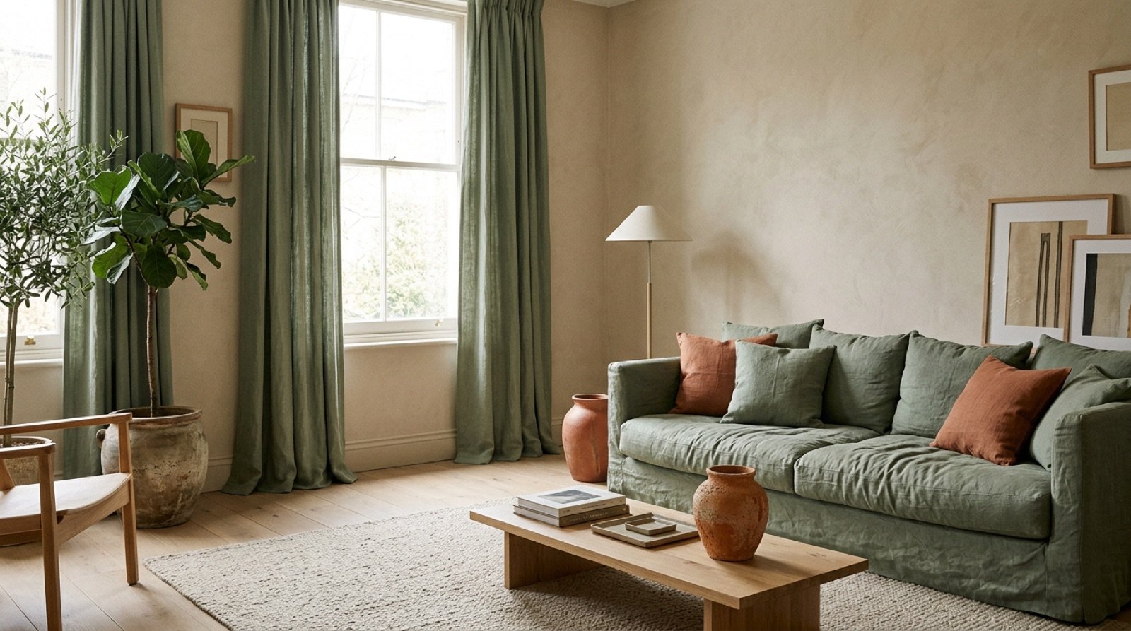
The percentages describe visual area, not objects. That distinction matters. Your walls, floor and ceiling are usually the largest surfaces in a room, so they almost always end up carrying the sixty, whether you planned it or not. A sofa, curtains and a large rug usually make up the thirty. Cushions, artwork, a lamp base or a vase become the ten.
So before you choose anything, stand in the doorway and ask what covers the most surface. If you have dark oak floors and white walls, you already have two big colours in play, and your “sixty” may really be a forty-forty split. That is fine. It just means the rule needs adjusting before you start buying cushions.
Why it works
The rule works because the eye needs a hierarchy. When three colours appear in roughly equal amounts, nothing leads and the room feels restless. When one colour clearly dominates, it becomes the background, the second colour gives shape to the room, and the accent gets noticed precisely because there is so little of it.
This is the same idea behind good spatial design generally: decide what is background, what is structure and what is the point of interest. We wrote about the same principle in terms of layout in spatial hierarchy in Japandi interiors. Colour is simply hierarchy you can see from across the room.
How to use it in a real room
Start with what you cannot change easily. Floors, kitchen units, a fireplace and built-in storage are expensive to replace, so let them set the dominant tone. Then choose the secondary colour from something you love and will live with for years, often a sofa or a large rug. Choose the accent last, and keep it cheap and easy to swap.
- Sixty: walls, floor, large built-in furniture. Usually a neutral or a muted colour.
- Thirty: sofa, curtains, rug, an accent wall, a large cabinet.
- Ten: cushions, throws, artwork, ceramics, lamp bases, flowers.
A tip that saves money: keep your ten percent in things that cost little. If you get tired of terracotta, swapping four cushions and a vase is an afternoon. Repainting a room is a weekend.
Three times to break it
When the room is very small
In a small bathroom or a narrow hallway, three distinct colours can make the space feel chopped up. Two colours, or one colour in several shades, often looks calmer and larger. Think eighty-twenty, or a single colour used from light to dark.
When the material is the colour
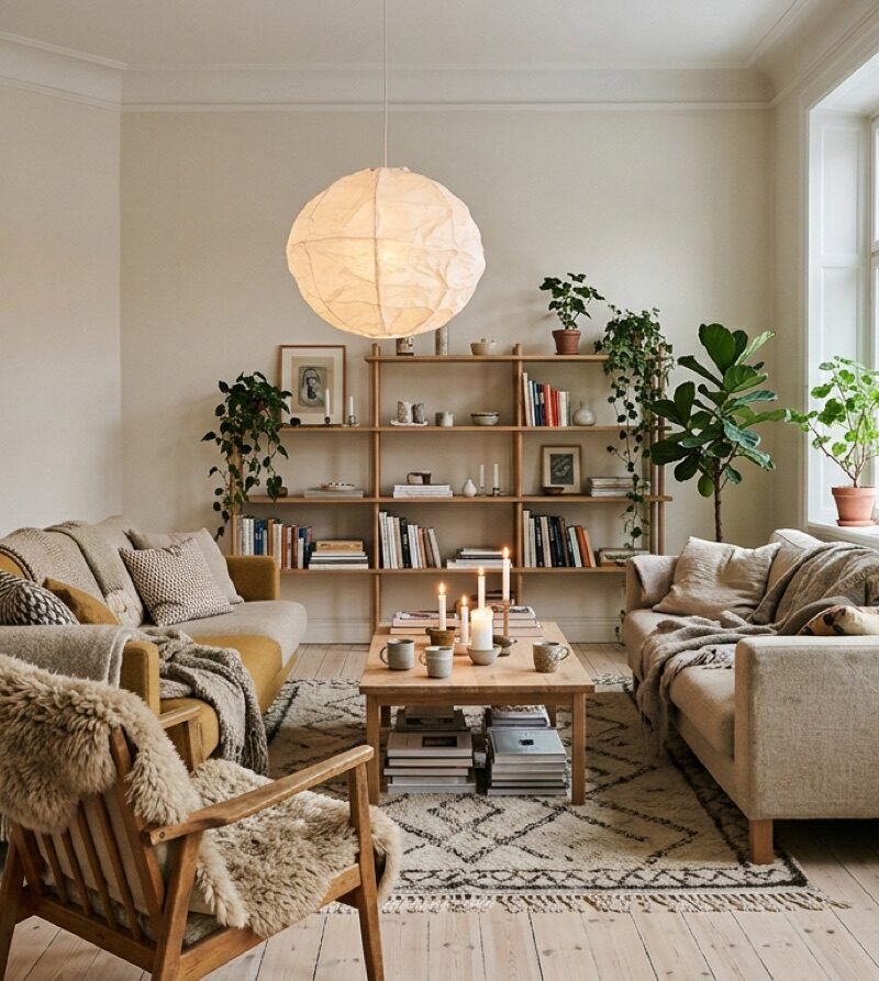
Wood, stone, brick and linen all carry colour, but they also carry texture. A room built from oak, limestone and undyed linen can be almost entirely “neutral” and still feel rich, because the variation comes from the surfaces rather than the paint. In rooms like this, counting percentages misses the point. Look at texture contrast instead: rough against smooth, matte against slightly reflective.
When you want drama on purpose
Dark, saturated rooms, such as a deep green study or a navy dining room, often use one colour across walls, ceiling and woodwork. This is called colour drenching. The rule disappears and the room becomes a single mood. It works best in rooms you use in the evening, where a cocooning feeling is the goal.
A quick exercise before you buy anything
Take a photo of your room and turn it to black and white on your phone. You will instantly see which tones dominate, where the contrast sits and whether anything is fighting for attention. Then turn the colour back on and ask a simple question: which colour do I notice first? If the answer is the one you wanted to be the accent, you are on the right track. If it is the wall colour, the room may need a stronger secondary colour or a clearer accent.
Rules like 60-30-10 are scaffolding. They are there to hold you up while you learn to see a room. Once you can feel when a space is out of balance, you will use the rule less and trust your eye more, which is exactly the point.